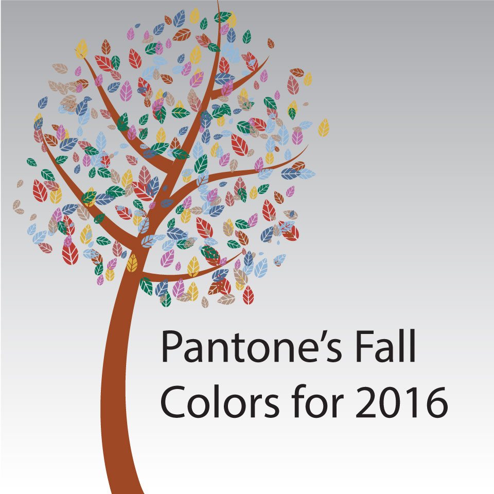
Fall brings changes to the colors outdoors, but it doesn’t stop there.
Pantone releases their fall colors annually. According to Pantone, this year’s fall color palette represents “a unity of strength, confidence and complexity.” The colors, inspired by “the desire for tranquility, strength and optimism” are led by the Blue family. Each of the individual colors stray from the typical fall shades to make vivacious statements.
Riverside is confident and practical. To bring this soothing and stable color into your home, consider napkins that follow the same color theme. Such a sensible shade lasts well through the season for your guests or family around the table.
The second shade of blue chosen for fall, Airy Blue nods to Serenity, one of the two Pantone colors of the year. This particular blue can easily fit into your home with candles to add a sense of warmth. Just like many of the other fall colors, Airy Blue is relatively easy to incorporate into your home and through the seasons.
If you’re looking to add a sharp and contemporary look in your home, check out Sharkskin. This color is bold, but natural. The edgy grey tone pairs well with bright or muted colors making it ideal in the form of sheets.
There’s no doubt that shades of red grab everyone’s attention. Aurora Red is one that’s warm and pleasing to the eye. To add this rich color to your kitchen, consider bright bakeware.
Warm Taupe is a shade that pairs well with any of the top 10 Fall colors. The timeless color suggests stability and trust. The versatile shade can be incorporated at your dinner table with a dinnerware set set that can be dressed up with complimentary table decor.
For a welcoming color, look at Dusty Cedar. As temperatures decrease, cozy up in this perfect fall version of pink with a soft blanket. This shade is fit for both fall and winter and the rose undertones will add a unique look to your couch.
If you’re searching for a sophisticated and elegant color, turn to Lush Meadow. Show off this vibrant color with natural green coasters. Lush Meadow is the color that let’s you bring the outdoors indoors.
Spicy Mustard is an unexpected color, but the zesty shade brings an uplifting splash of vibrancy. Set the dining table with a runner that brings excitement to a decorative place setting. Spicy Mustard pairs especially well with Riverside, Sharkskin and Potter’s Clay.
Potter’s Clay is full of orange undertones that make it perfect for both fall and winter. The earthy shade references the outdoor color changes of fall. Add a pair of taper candles to your dining room or mantle to bring the neutral earth tone indoors.
On the other hand, Bodacious is a more lively and electrifying shade of purple for the fall season. If you’d like to make a statement with this fall color in your living room, choose a soft throw pillow. Just like the rest of the fall palette, Bodacious pairs well with one or all of the colors to add vibrance in your home.


